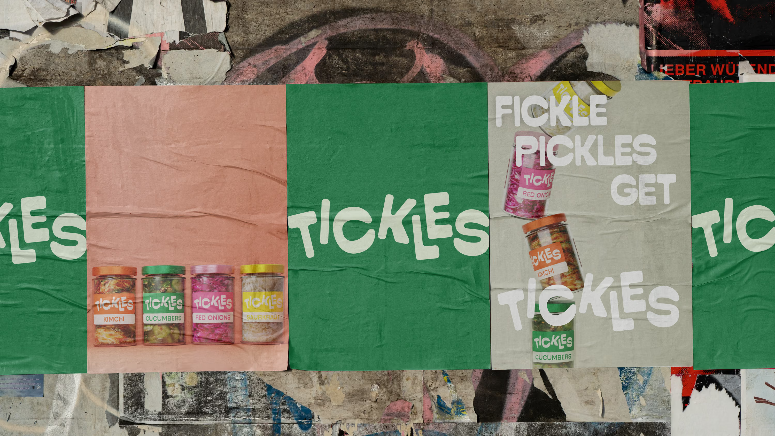
Tickles
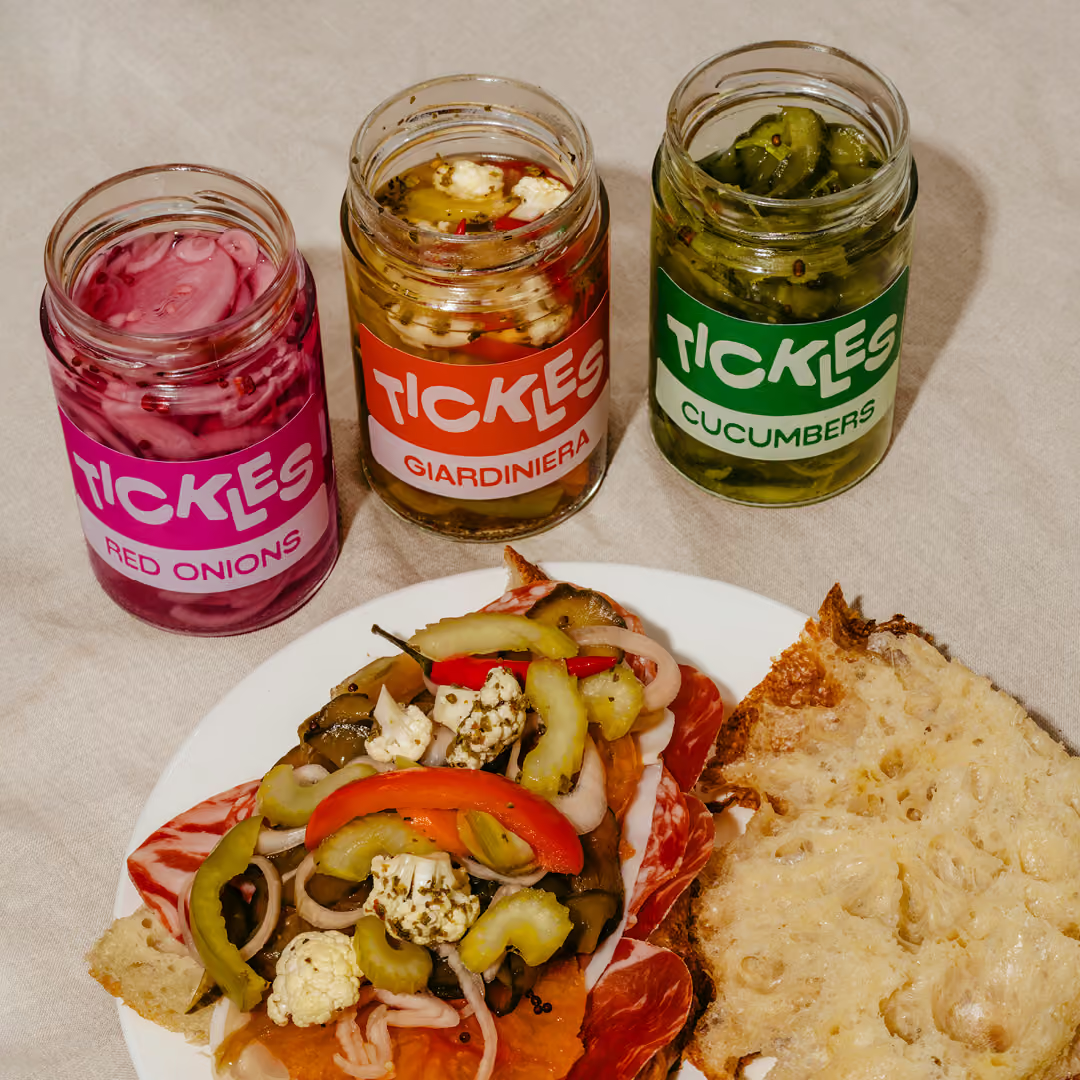
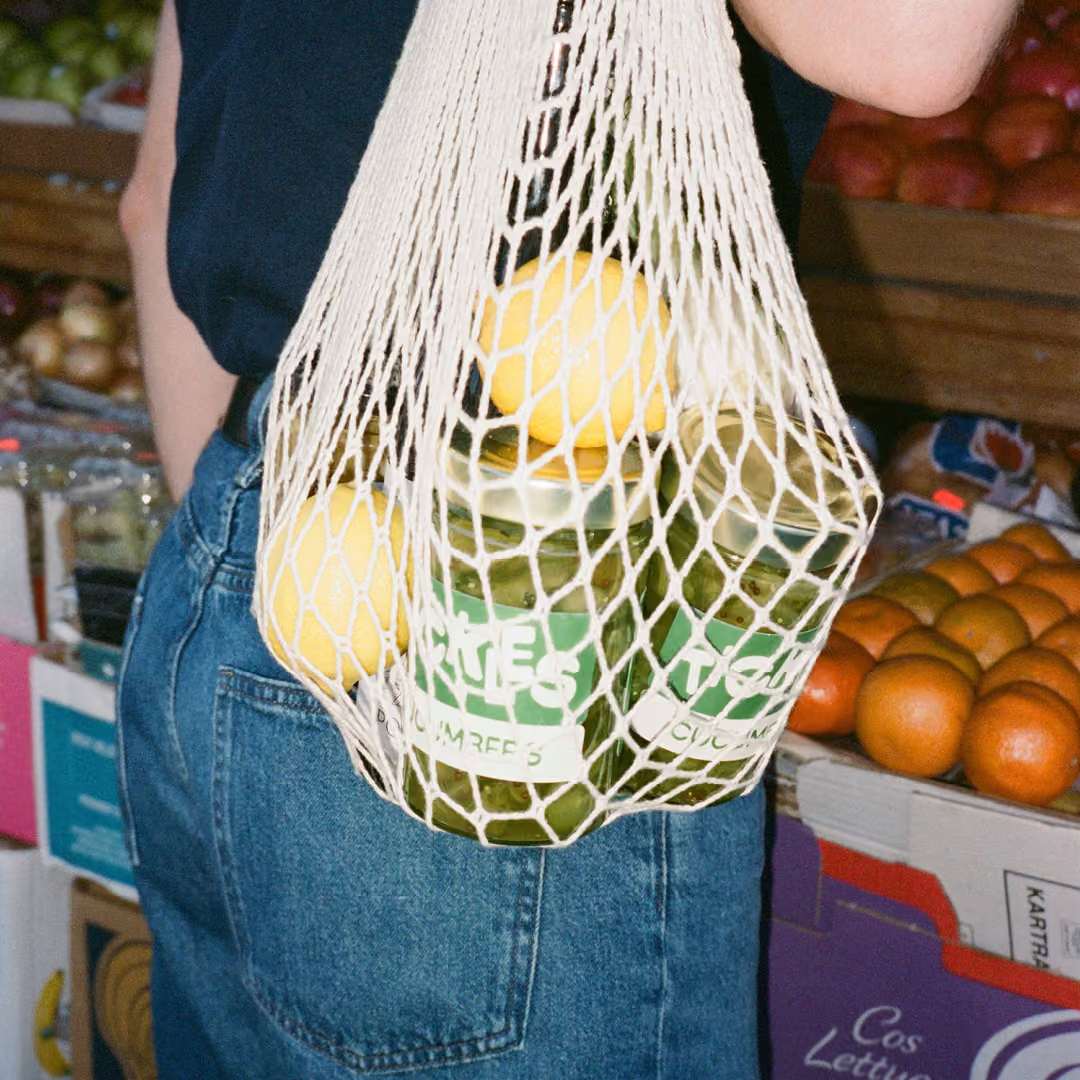
Tickles is a pickle brand with playfulness and joy running through its heart. From the name to the campaign, we wanted to embrace the silliness of these pickled wonders.
Brand identity
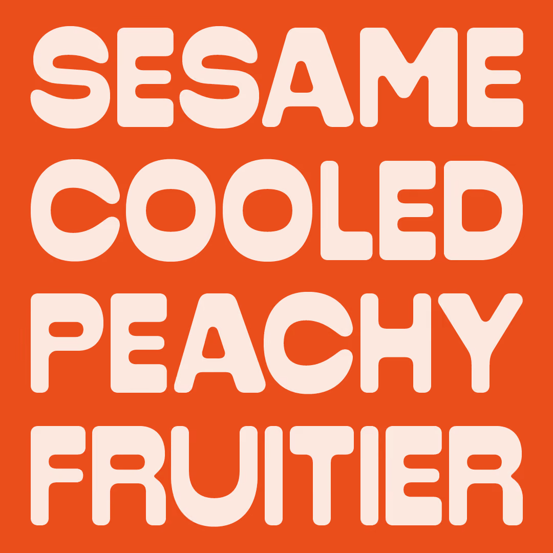
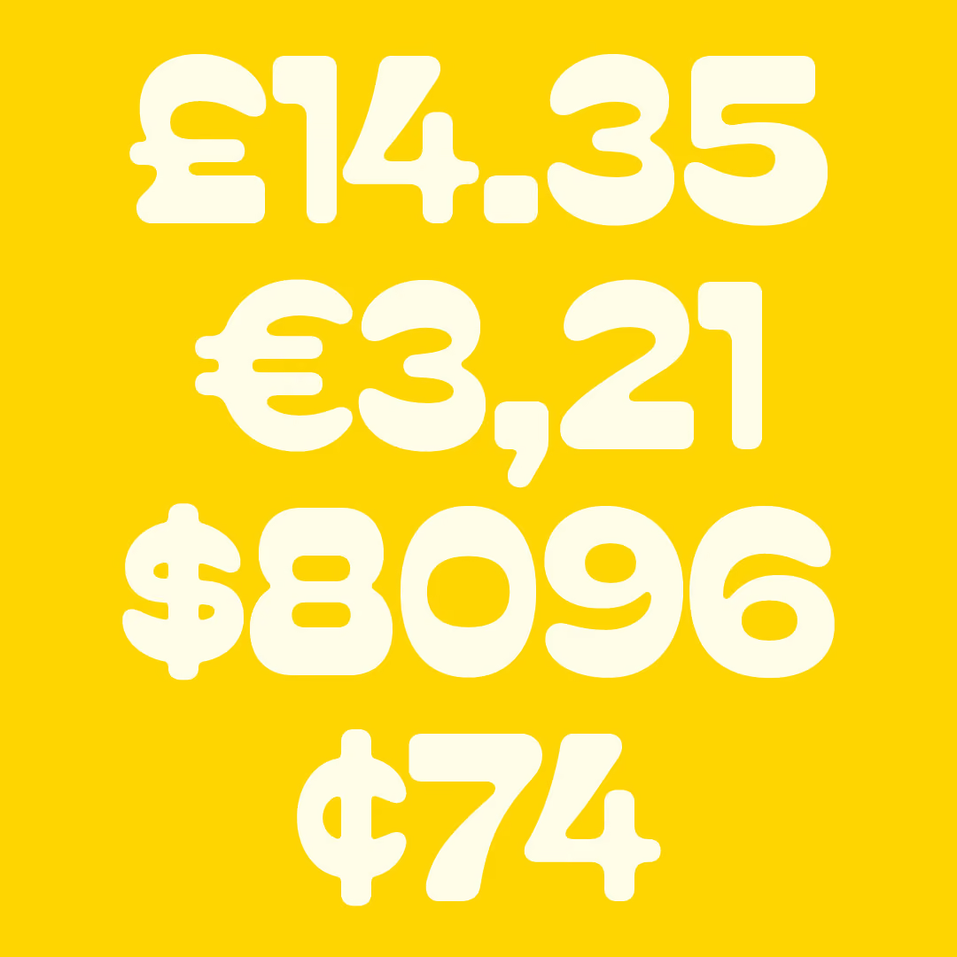
Bespoke typeface
Packaging
Art direction
Copywriting
Campaign

Play all day
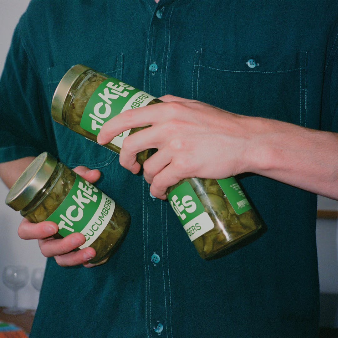
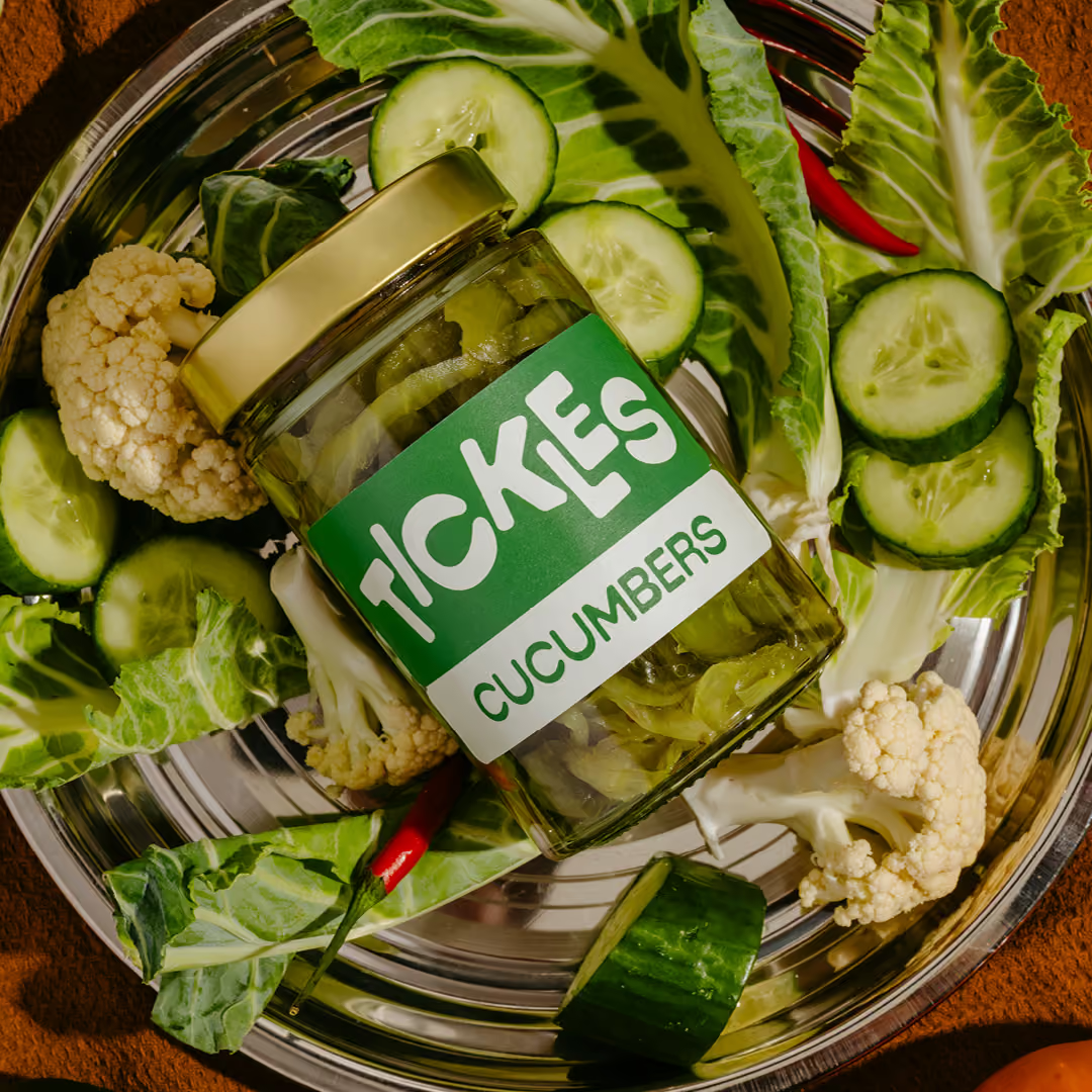
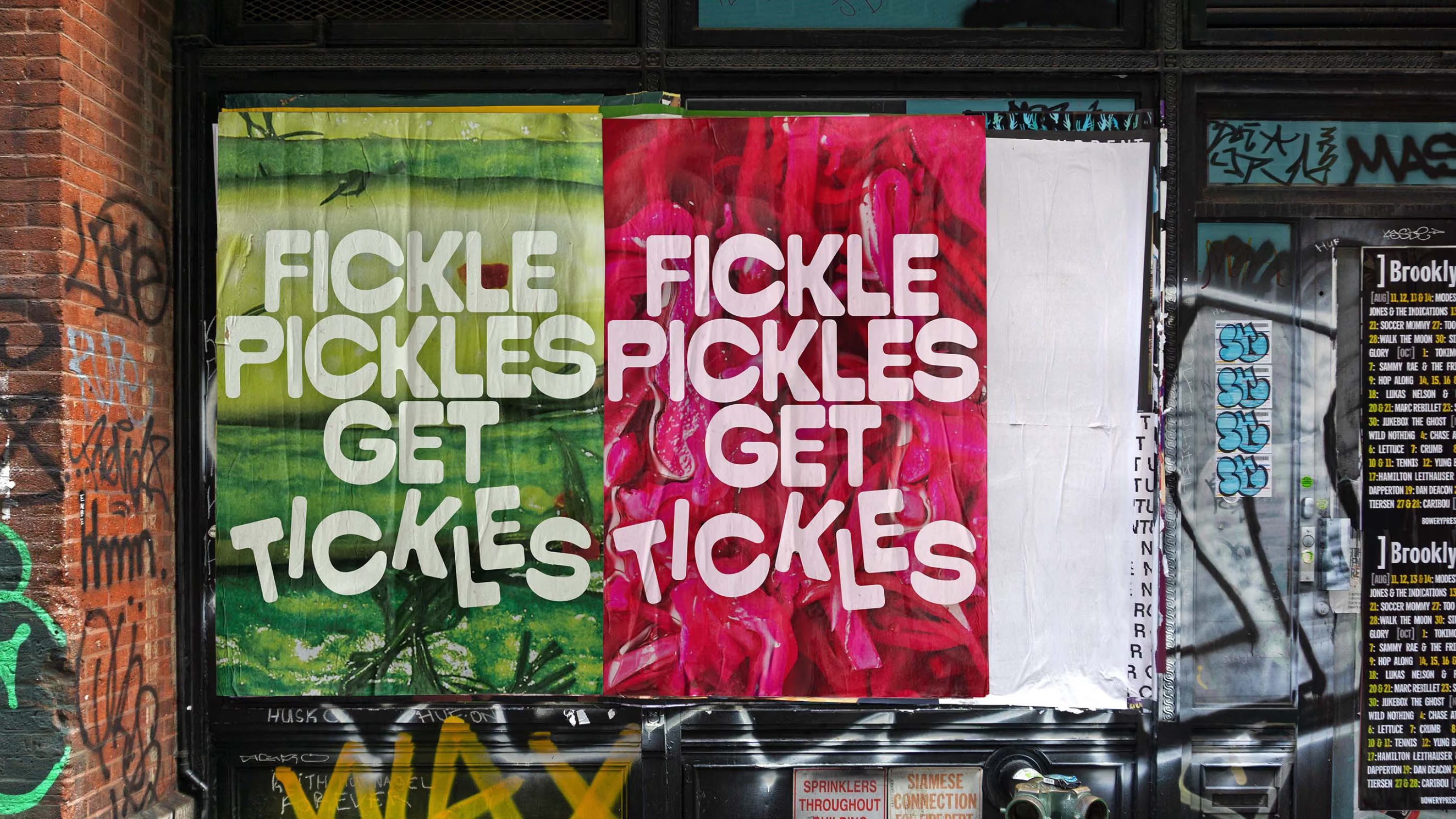
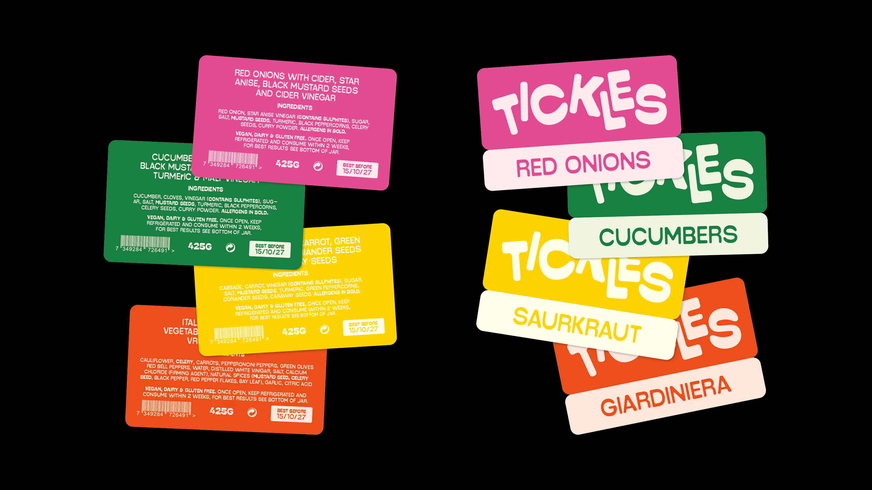
Tickles doesn't take itself too seriously, and neither did we with the execution of the brand. We were happy to move away from the single wordmark and deliberately jumbled the letters across different executions, squeezing them as if jarred and left to pickle. That same spirit runs through the copy with a silly lightheartedness across campaigns. Every touchpoint was an excuse to have a bit of fun with it.
Letters never looked so fun
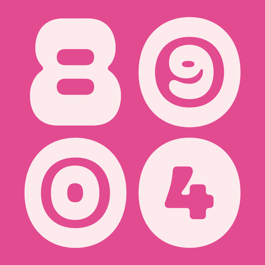
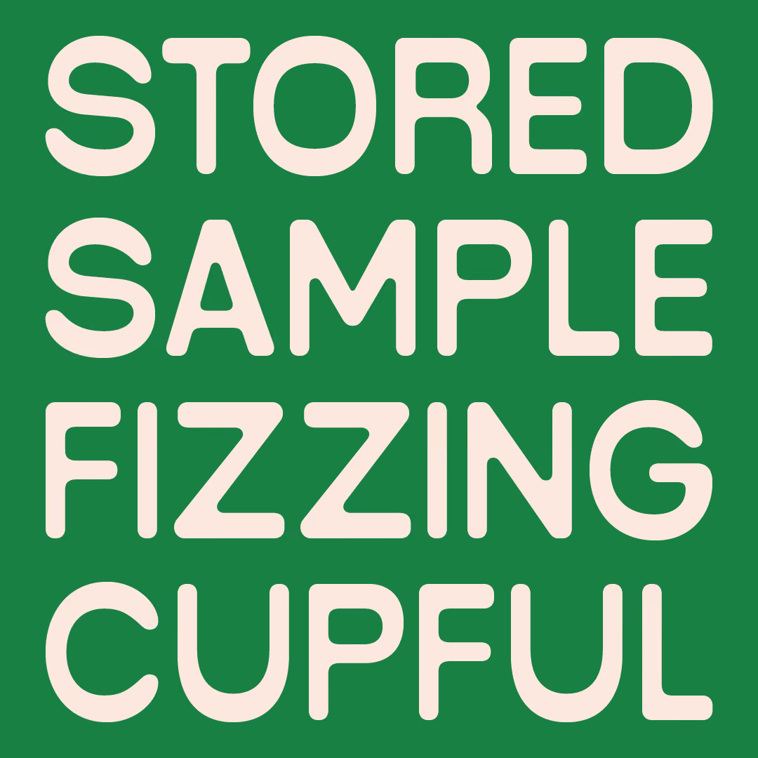
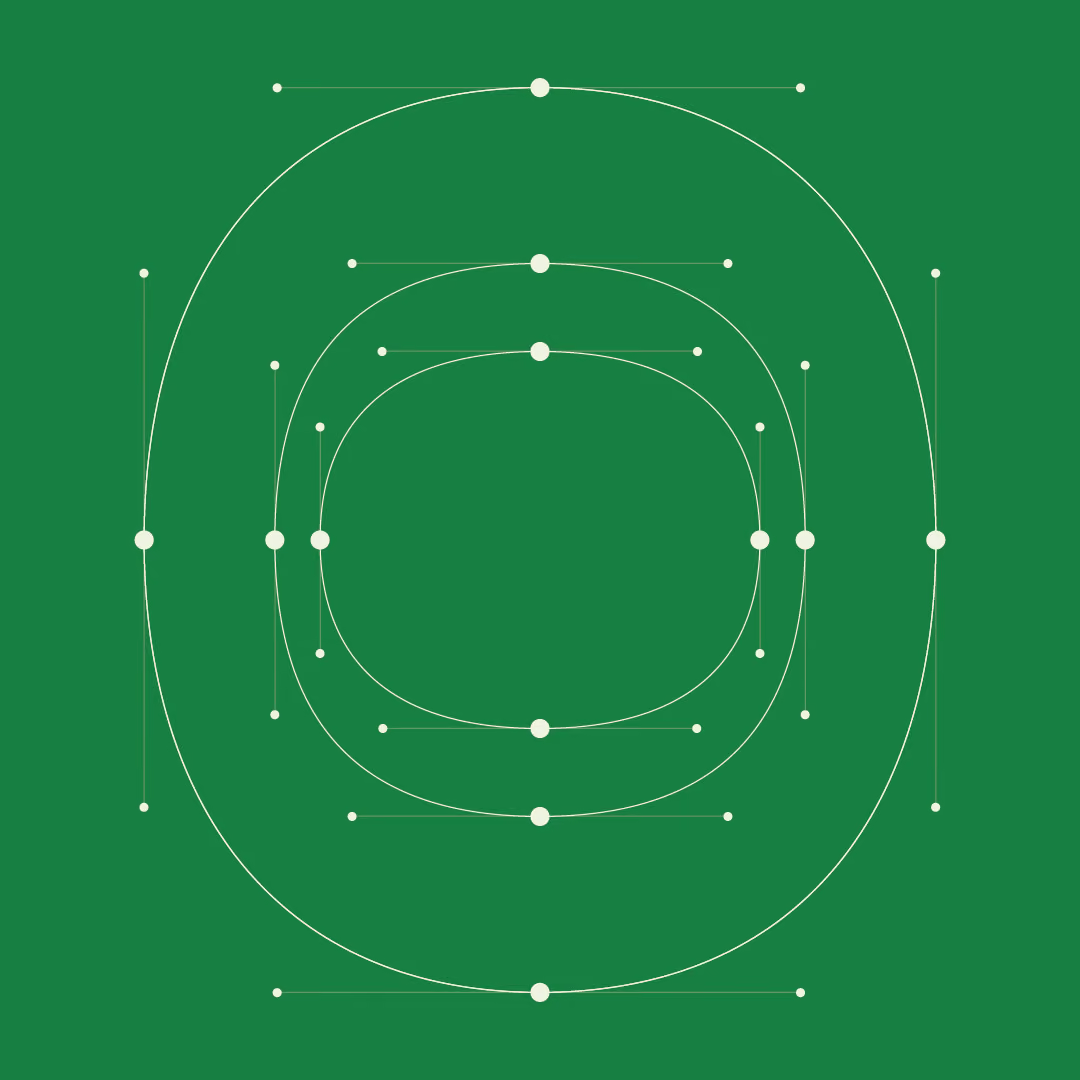
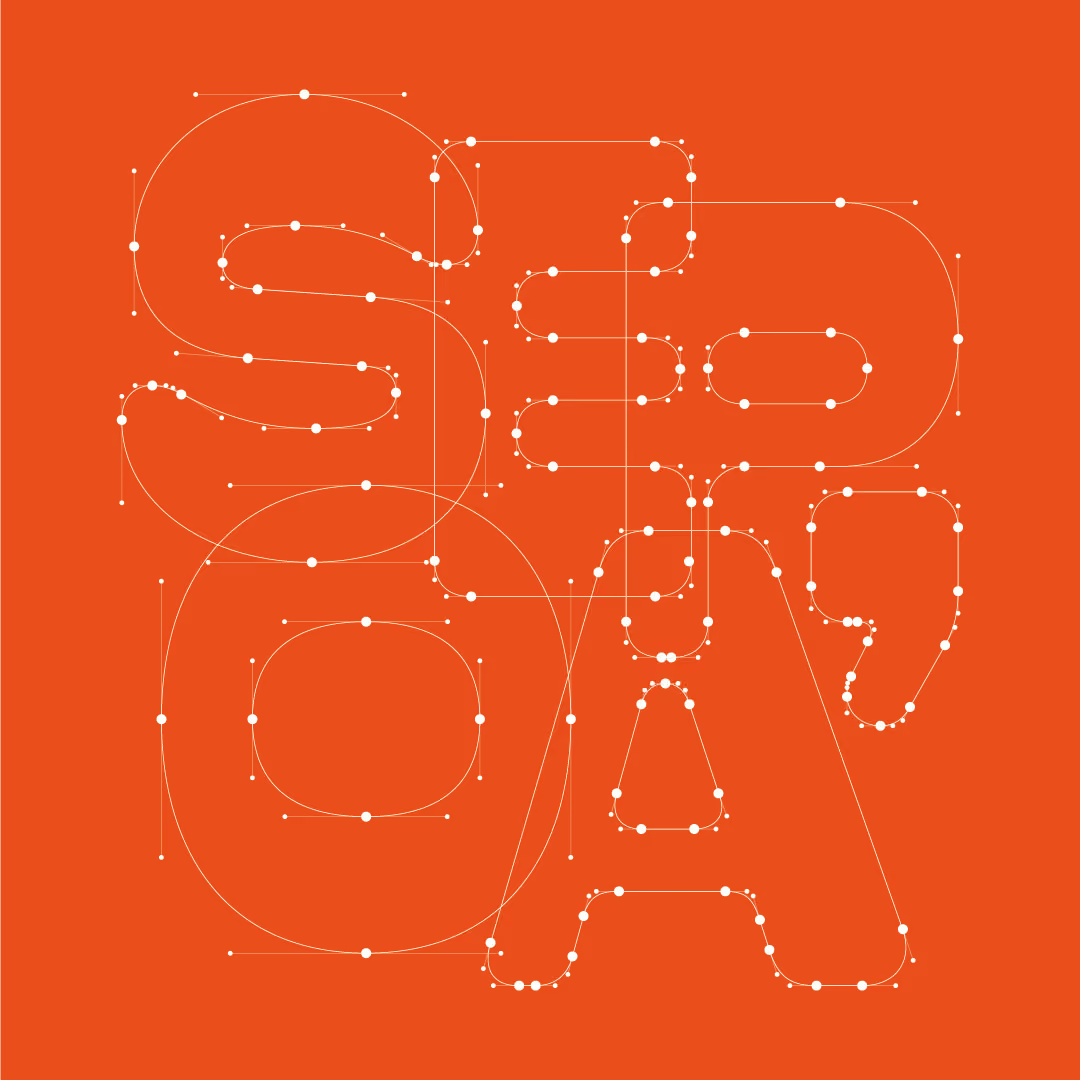
At the heart of the identity is a custom typeface, built specifically for Tickles and loaded with personality. Alongside the standard letterforms sits a set of playful alternate glyphs which we swapped in across packaging, labels and marketing to keep the brand feeling handmade and a little unpredictable, rather than locked into one static expression.